Choosing the right colors for your wedding can set the tone for your entire celebration. The perfect palette reflects your personal style, complements your venue, and creates a cohesive atmosphere.
Wedding colors influence everything from invitations to decor, attire, and even the mood of your guests. Careful selection ensures a visually stunning and memorable event.
Considering factors like seasonality and color psychology can help guide your decision-making process. These elements add depth and meaning to your chosen palette.
This guide will walk you through the key considerations for selecting wedding colors that truly represent you as a couple and create the ambiance you desire for your special day.
Understanding Color Psychology in Weddings
Colors evoke specific emotions and associations, which can significantly impact the atmosphere of your wedding. Understanding these psychological effects helps in creating the desired mood:
- Red: Passion, love, excitement
- Blue: Calm, trust, stability
- Green: Growth, harmony, nature
- Purple: Luxury, creativity, romance
- Yellow: Joy, energy, optimism
- Orange: Warmth, enthusiasm, adventure
Consider how you want guests to feel at your wedding and choose colors that align with those emotions. For example, a combination of blue and white can create a serene, elegant atmosphere perfect for a coastal wedding.
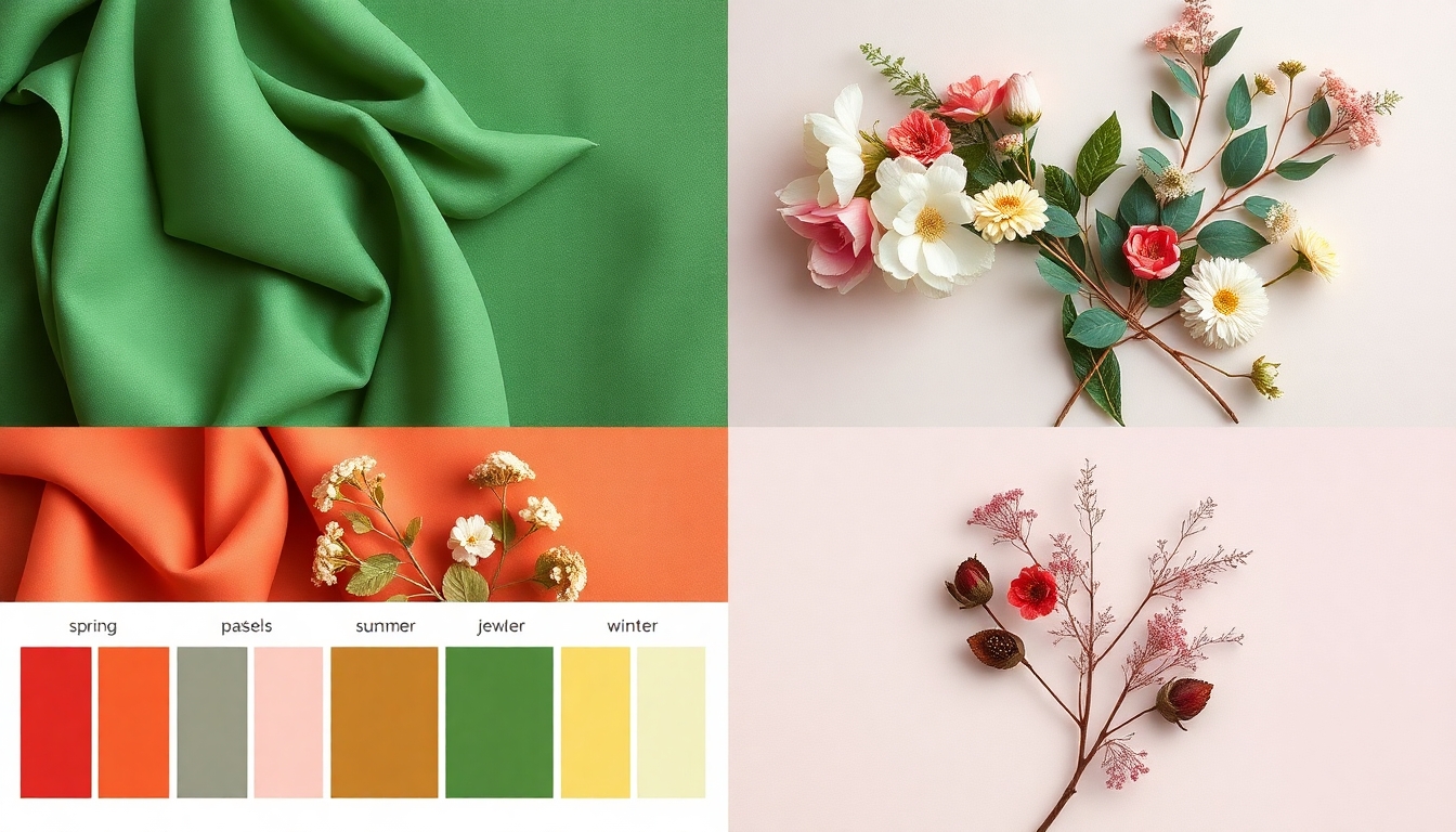
Seasonal Color Palettes for Weddings
Each season offers a unique color palette inspired by nature. Aligning your wedding colors with the season can create a harmonious and timely feel:
Spring: Soft pastels, fresh greens, and light floral hues
Summer: Bright, vibrant colors or cool ocean tones
Fall: Rich jewel tones, warm earthy colors, and deep reds
Winter: Icy blues, silver, white, and deep emerald or burgundy
Example: A fall wedding might feature a palette of burgundy, forest green, and gold, reflecting the changing leaves and cozy atmosphere of the season.
Incorporating Your Venue into Color Selection
Your wedding venue plays a crucial role in determining your color palette. Consider these factors:
- Existing colors in the space (walls, carpets, furniture)
- Natural surroundings (beach, garden, mountains)
- Lighting conditions (natural light, artificial lighting)
Choose colors that complement or enhance your venue rather than clash with it. For instance, if you’re having a barn wedding, consider incorporating rustic tones like sage green, warm neutrals, and pops of coral or sunflower yellow.
Creating a Cohesive Color Scheme
A well-balanced color scheme typically includes:
- 1-2 main colors
- 1-2 accent colors
- 1 metallic or neutral shade
Use the 60-30-10 rule as a guide:
60% dominant color
30% secondary color
10% accent color
This balance ensures visual interest without overwhelming the senses. For example, a classic navy and blush wedding might use:
- Navy (60%) for bridesmaids’ dresses and table linens
- Blush (30%) for floral arrangements and groomsmen’s ties
- Gold (10%) as an accent in decor elements and tableware
Testing Your Color Palette
Before finalizing your wedding colors, it’s essential to see how they work together in various applications:
1. Create a mood board with fabric swatches, paint chips, and inspiration images
2. Test colors in different lighting conditions (daylight, evening, indoor, outdoor)
3. Apply your palette to sample invitations, table settings, and floral arrangements
This process helps identify any clashes or imbalances early on, allowing for adjustments before making final decisions. Consider consulting with your wedding planner or a color specialist for professional input on your chosen palette.
Personalizing Your Color Palette
While trends and traditions can guide your color choices, don’t be afraid to incorporate personal elements that reflect your unique story as a couple:
• Include colors that hold special meaning for you both
• Draw inspiration from shared experiences or favorite places
• Incorporate family heirlooms or cultural traditions through color choices
For example, if you met in Italy, you might choose a Tuscan-inspired palette of terracotta, olive green, and warm yellows. This personal touch adds depth and significance to your wedding aesthetics.
Balancing Bold and Neutral Colors
Creating a visually striking palette often involves balancing bold colors with neutrals:
• Use neutral colors as a base to anchor bolder hues
• Incorporate pops of vibrant colors for visual interest
• Consider ombre or gradient effects for a softer transition between shades
A modern wedding might feature a primarily white and grey palette with strategic pops of coral or emerald green in floral arrangements and accessories.
Considering Photography and Videography
Your chosen colors will significantly impact your wedding photos and videos. Keep these factors in mind:
• Some colors photograph better than others (pastels vs. neons)
• High contrast color combinations can create striking visual imagery
• Avoid colors that may clash or create unflattering skin tones
Consult with your photographer and videographer about how your chosen palette will translate in different lighting conditions and settings.
Adapting Your Palette to Different Wedding Elements
Once you’ve settled on a color scheme, consider how to apply it consistently across various wedding elements:
1. Invitations and stationery
2. Attire for the wedding party
3. Floral arrangements and bouquets
4. Table settings and linens
5. Lighting and decor
6. Wedding cake and desserts
7. Favors and gifts
Consistency in color application helps create a cohesive and polished look throughout your celebration.
Conclusion
Selecting the perfect wedding color palette is a journey of self-expression and creativity. By considering factors such as psychology, seasonality, venue, and personal significance, you can create a visually stunning and meaningful atmosphere for your special day.
Remember that while guidelines and trends can be helpful, your wedding colors should ultimately reflect your unique style and love story. Trust your instincts, be open to expert advice, and don’t be afraid to think outside the traditional color box.
With thoughtful planning and attention to detail, your chosen palette will set the stage for a beautiful, memorable celebration that truly represents you as a couple.